

(多图预警,图存在 GitHub,加载慢)
1.简介
1.1导入
1 | import matplotlib.pyplot as plt |
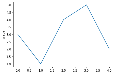
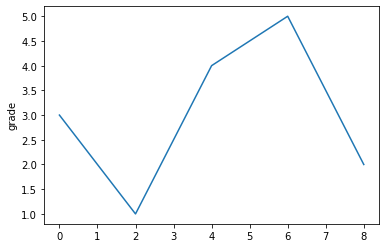
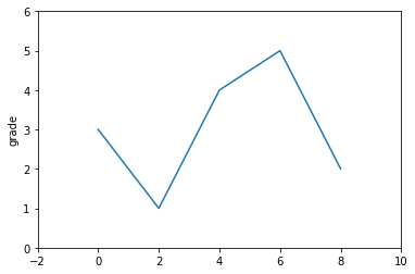
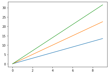
1.2折线图 / x轴y轴
1 | # 只指定y轴,x轴默认列表索引 |
1 | # 同时指定x、y轴 |
1 | # 同时指定x、y轴,指定x轴尺度-1~10,y轴0~6 |
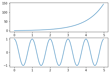
1.3函数图像
1 | a = np.arange(0.0, 5.0, 0.02) # x轴 |
1.4网格线
1 | plt.plot([0,2,4,6,8], [3,1,4,5,2]) |
2.plot函数
plt.plot(x, y, format_string, **kwargs)
- x:X轴数据,列表或数组,可选
- y:Y轴数据,列表或数组
- format_string:控制曲线的格式字符串,可选
- **kwargs:第二组或更多(×,y,format_string),多条曲线
当绘制多条曲线时,各条曲线的x不能省略
2.1基本用法
1 | a = np.arange(10) |
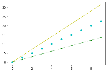
2.2格式控制
format_string由颜色字符、风格字符和标记字符组成
- 颜色字符:线条和点的颜色
- 风格字符:线条的样子
- 标记字符:点的样子
颜色字符:
| 颜色字符 | 说明 | 颜色字符 | 说明 |
|---|---|---|---|
| ‘b’ | 蓝色 | ‘m’ | 洋红色magenta |
| ‘g’ | 绿色 | ‘y’ | 黄色 |
| ‘r’ | 红色 | ‘k’ | 黑色 |
| ‘c’ | 青绿色cyan | ‘w’ | 白色 |
| ‘#008000’ | RGB | ‘0.8’ | 灰度值字符串 |
风格字符:
| 风格字符 | 说明 | 风格字符 | 说明 |
|---|---|---|---|
| ‘-‘ | 实线 | ‘:’ | 虚线 |
| ‘–’ | 破折线 | ‘-.’ | 点划线 |
| ‘’ | 无线条 |
标记字符:
| 标记字符 | 说明 | 标记字符 | 说明 |
|---|---|---|---|
| ‘.’ | 点标记 | ‘s’ | 实心方形标记 |
| ‘,’ | 像素标记(极小点) | ‘p’ | 实心五角标记 |
| ‘o’ | 实心圈标记 | ‘*’ | 星形标记 |
| ‘v’ | 倒三角标记 | ‘h’ | 竖六边形标记 |
| ‘^’ | 上三角标记 | ‘H’ | 横六边形标记 |
| ‘>’ | 右三角标记 | ‘+’ | 十字标记 |
| ‘<’ | 左三角标记 | ‘x’ | x标记 |
| ‘1’ | 下花三角标记 | ‘D’ | 菱形标记 |
| ‘2’ | 上花三角标记 | ‘d’ | 瘦菱形标记 |
| ‘3’ | 左花三角标记 | ‘|’ | 垂直线标记 |
| ‘4’ | 右花三角标记 |
1 | a = np.arange(10) |
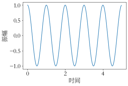
3.中文显示
| 中文字体 | 说明 | 中文字体 | 说明 |
|---|---|---|---|
| ‘SimHei’ | 中文黑体 | ‘FangSong’ | 中文仿宋 |
| ‘Kaiti’ | 中文楷体 | ‘YouYuan’ | 中文幼圆 |
| ‘LiSu’ | 中文隶书 | ‘STSong’ | 华文宋体 |
3.1全局中文
步骤
- 导入matplotlib
- 调用matplotlib的rcParams
| rcParams属性 | 说明 |
|---|---|
| ‘font.family’ | 字体名字,见上表 |
| ‘font.style’ | 字体风格,正常’normal’,斜体’italic’ |
| ‘font.size’ | 字体大小,’large’、’x-small’或整数字号 |
使用方法(实例):
1 | import numpy as np |
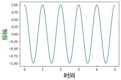
3.2局部中文
1 | import numpy as np |
4.文本显示
| 函数 | 说明 | 函数 | 说明 |
|---|---|---|---|
| plt.xlabel() | X轴文本标签 | plt.text() | 任意位置增加文本 |
| plt.ylabel() | Y轴文本标签 | plt.annotate() | 任意位置增加带箭头注解 |
| plt.title() | 图形标题 |
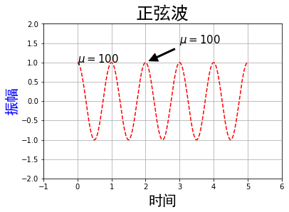
plt.text(0, 1, r'$\mu=100$', fontsize='15')
- 在(0,1)位置输出
- 内容$\mu=100$
- 字体大小为15
plt.annotate(r'$\mu=100$', fontsize='15', xy=(2,1), xytext=(3,1.5), arrowprops=dict(facecolor='black', shrink=0.1, width=2))
- 内容$\mu=100$
- 字体大小为15
- 箭头坐标(2,1)
- 文字坐标(3,1.5)
- 箭头样式(黑色,线两端与坐标点距离0.1,宽2)
1 | a = np.arange(0.0, 5.0, 0.02) |
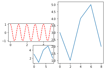
5.子绘图区域
5.1简单划分
1 | # 分为nrows行,ncols列,共nrows*ncols个区域 |
演示:
1 | a = np.arange(0.0, 5.0, 0.02) # x轴 |
5.2复杂划分
函数:plt.subplot2grid(GridSpec, CurSpec, colspan=c, rowspan=r)
plt.subplot2grid((3,4), (0,2), colspan=2, rowspan=3)
- 划分为3行4列
- 根据下标(0,2)选中第1行第3列
- 横向长度为2,纵向长度为3的区域
1 | a = np.arange(0.0, 5.0, 0.02) |
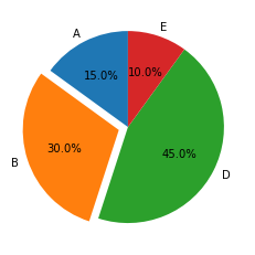
6.饼状图
1 | labels = ['A', 'B', 'D', 'E'] # 标签 |
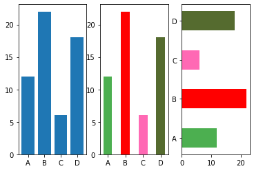
7.柱状图
1 | x = np.array(["A", "B", "C", "D"]) |
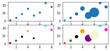
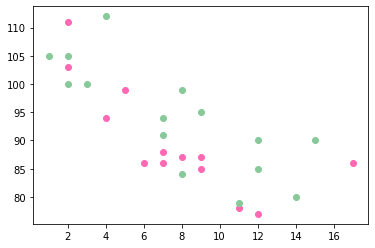
8.散点图
matplotlib.pyplot.scatter(x, y, s=None, c=None, marker=None, cmap=None, norm=None, vmin=None, vmax=None, alpha=None, linewidths=None, *, edgecolors=None, plotnonfinite=False, data=None, **kwargs)
参数说明:
x,y:长度相同的数组,也就是我们即将绘制散点图的数据点,输入数据。
s:点的大小,默认 20,也可以是个数组,数组每个参数为对应点的大小。
c:点的颜色,默认蓝色 ‘b’,也可以是个 RGB 或 RGBA 二维行数组。
marker:点的样式,默认小圆圈 ‘o’。
cmap:Colormap,默认 None,标量或者是一个 colormap 的名字,只有 c 是一个浮点数数组的时才使用。如果没有申明就是 image.cmap。
norm:Normalize,默认 None,数据亮度在 0-1 之间,只有 c 是一个浮点数的数组的时才使用。
vmin,vmax::亮度设置,在 norm 参数存在时会忽略。
alpha::透明度设置,0-1 之间,默认 None,即不透明。
linewidths::标记点的长度。
edgecolors::颜色或颜色序列,默认为 ‘face’,可选值有 ‘face’, ‘none’, None。
plotnonfinite::布尔值,设置是否使用非限定的 c ( inf, -inf 或 nan) 绘制点。
**kwargs::其他参数。
1 | x = np.array([1, 2, 3, 4, 5, 6, 7, 8]) |
通过颜色条设置颜色 见Matplotlib 散点图 | 菜鸟教程 (runoob.com)
同一图中多组数据:
1 | x = np.array([5,7,8,7,2,17,2,9,4,11,12,9,6]) |
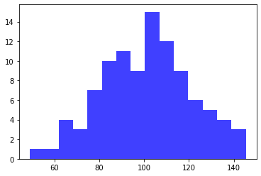
9.直方图
plt.hist(x, bins=None, range=None, density=None, weights=None, cumulative=False, bottom=None, histtype='bar', align='mid', orientation='vertical', rwidth=None, log=False, color=None, label=None, stacked=False, normed=None, *, data=None, **kwargs)
- x:数据
- bins:取值范围分为bins份,默认10
- density:False频数,True频率
- histtype:{‘bar’, ‘barstacked’, ‘step’, ‘stepfilled’}。’bar’是传统的条形直方图;’barstacked’是堆叠的条形直方图;’step’是未填充的条形直方图,只有外边框;’stepfilled’是有填充的直方图。当histtype取值为’step’或’stepfilled’,rwidth设置失效,即不能指定柱子之间的间隔,默认连接在一起。
- alpha:透明度
1 | # 生成符合正态分布的随机数组 |
- 本文标题:数据预处理—matplotlib
- 本文作者:kai
- 创建时间:2022-06-25 11:50:23
- 本文链接:https://kainote.top/2022/06/25/数据预处理—matplotlib/
- 版权声明:本博客所有文章除特别声明外,均采用 BY-NC-SA 许可协议。转载请注明出处!